The final Monthly Media for 2019 is fittingly from Dr Chris Jordan, who brought the year in with his ionospheric “fighter jet” event (January 2019). That event showcased just one unusual piece of ionospheric activity of many thousands of observations. Here he details what can be learned from looking at many events, and what is yet to be understood.

The image of refracted sunlight below the surface of rippling water. Image credit: unsplash.com @chrislawton
When you look up at the sky at night you are looking straight through the ionosphere; it doesn’t affect what you see as optical light completely ignores it. But, within the lower frequencies of radio astronomy, the ionosphere can distort what is being observed, pushing the image around on the sky. The ionosphere is still not directly visible, but can be “seen” by a change in the position of a radio galaxy from where it should be. The galaxy has not moved, but the ionosphere is refracting its light to make it look like it’s moved. You can think of it like the effect that water waves has on sunlight, as shown in the above image.
The Murchison Widefield Array (MWA), a low frequency radio telescope in Western Australia that can see a very large section of the sky, is an ideal instrument for studying the effects of the ionosphere on radio telescopes, including the MWA itself. This is important for very sensitive observations such as the search for the Epoch of Reionisation (EoR) signal this group is searching for.
Chris has calibrated MWA data from 2013 to 2016, using 18,681 observations from between those years (inclusively – including the years given) over 332 nights, where each observation lasted 2 minutes. These observations were taken with the EoR fields high in the sky – the EoR fields are those believed to have few radio sources, which helps the observation of the EoR (see Ronniy’s Monthly Media from June 2019).
The information considered important for these observations is:
1. The distance between where the radio source should be and where it is observed to be (the “offset”) – how far away is the image of the source from where it should be?
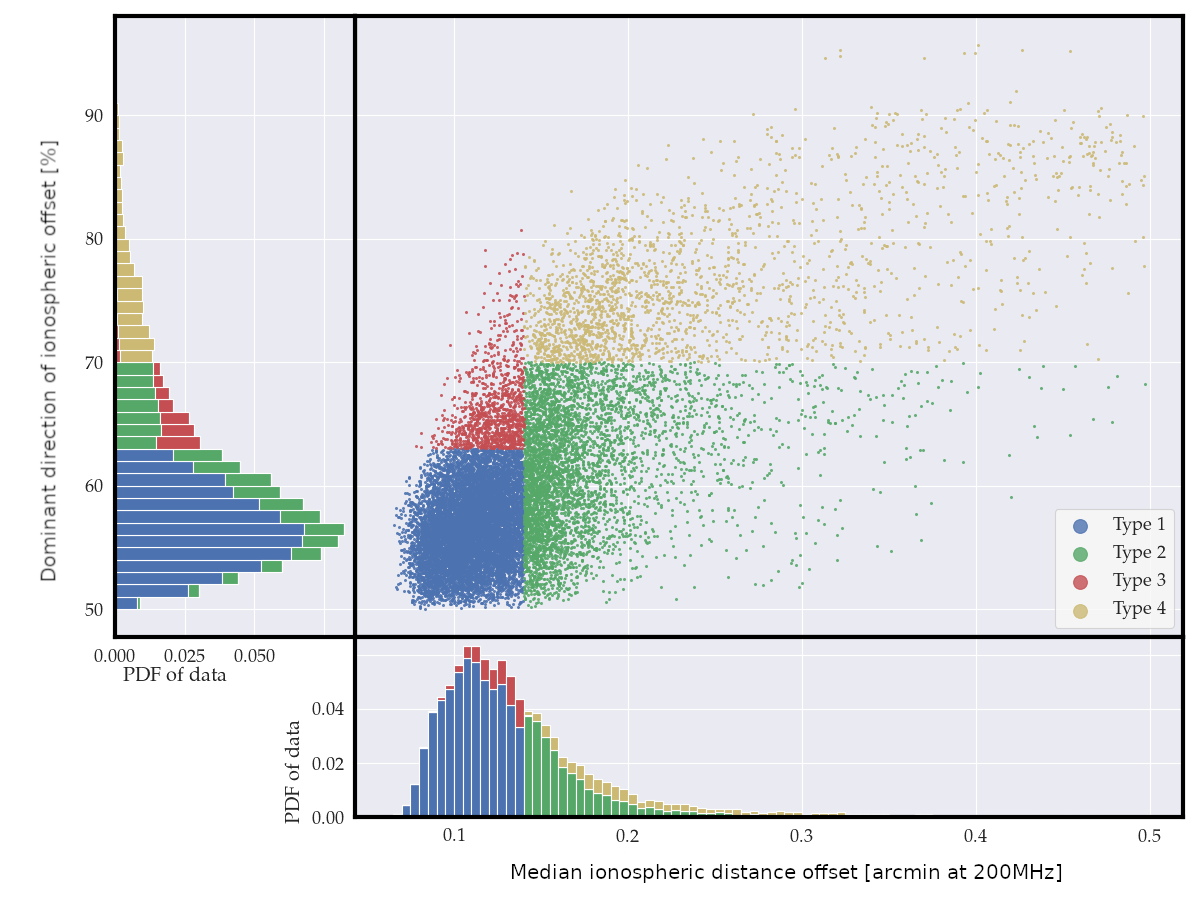
2. The direction of the offsets – do the offsets point in similar directions? If the directions are similar, it indicates that the ionosphere is active and corrupting our astronomical data. Low values are around 55%, high values are more than 70%.
The source positions are measured in reference to the PUMA source catalogue.

The y-axis is the dominant direction of each observation’s offset. The x-axis is the middlemost value of each observation’s distance offset. The main section (top-right) shows where each observation lies against those axes. The bottom section shows where that same data would “fall” onto the x-axis, the distance offset. In the same way, the left section shows where the data would “fall” onto the y-axis, the direction offset. These sections show that most of the observations are in the lower-left corner of the plot – exhibiting a “well behaved” or “good” ionosphere. Four types of ionospheric activity have been arbitrarily chosen to help categorise the data, shown in the different colours.
The above plot shows how all the 18,681 observations are split into four different types: 1, 2, 3 and 4. The type 1 observations, the most common, are the “inactive” ones (considered “good”). These observations are the best for searching for the faint EoR signal, and other sensitive radio astronomy. The type 4 observations are the “extremely active” observations, and cannot be used for radio astronomy (considered “bad”). It is the type 2 and 3 observations that are less clear on useability for radio astronomy.
Type 2 observations have large offsets in the position of a distant radio source, but within an observation do not favour any direction. Type 3 have small offset distances within each observation, but there is a preferred direction of the offset. The consistent direction, though small offset, from the type 3 observations has a larger effect on the data quality, and is therefore considered worse than type 2.
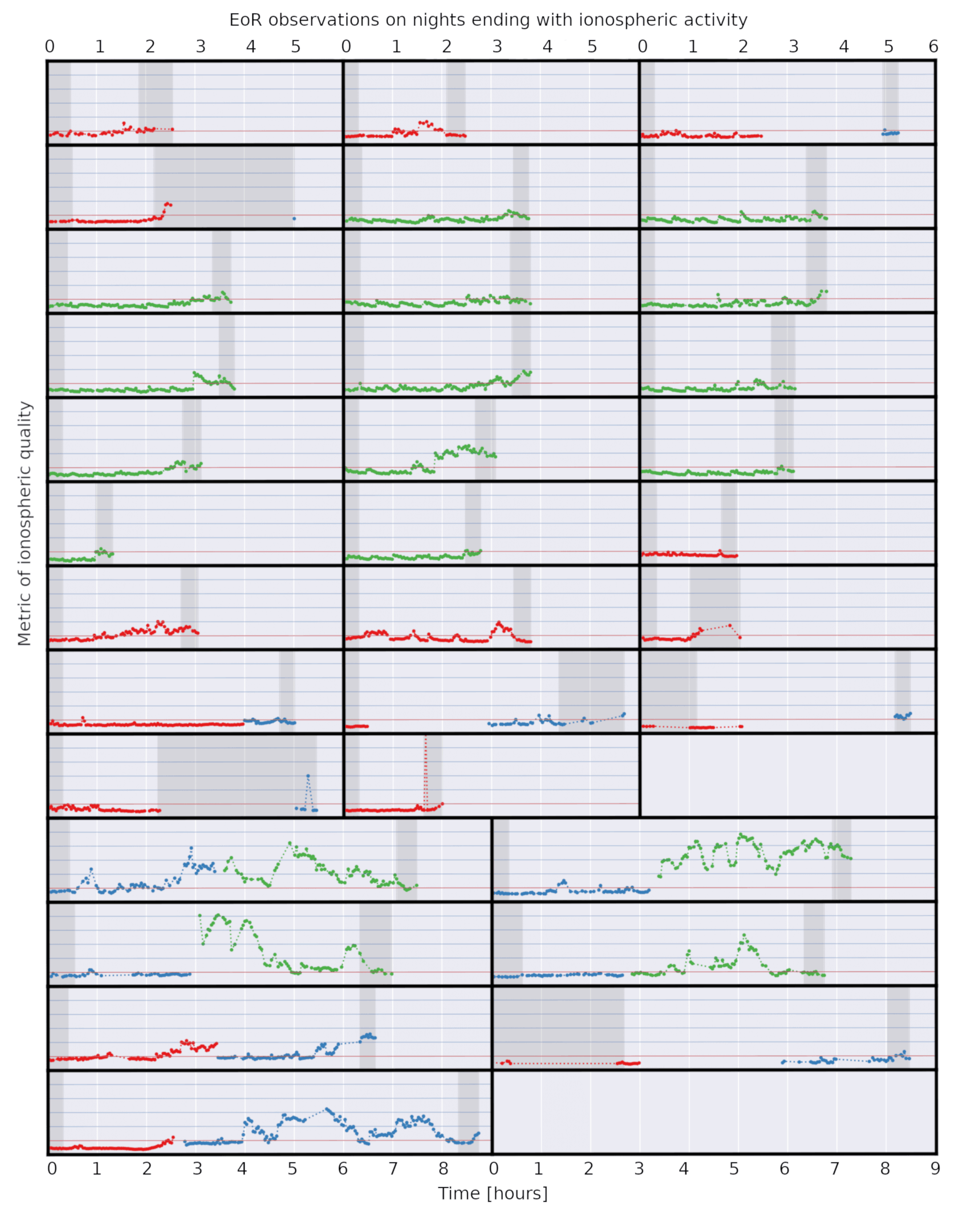
The below plot shows observations of 34 nights that have a “good start, good middle and bad end”. While the most common type of activity over a night is “inactive” from start to end (50% of the nights observed), it is also reasonably common for the ionospheric activity to start as “inactive” and become “active” over the night (about 17% of the nights observed).

34 nights with a “good start, good middle, bad end”. The red horizontal line is the threshold for “goodness”. The dark grey regions show the “start” and “end” of each night. For a “good start” all individual observations are below the red line. For a “good middle” there is a run of at least 10 individual observations below the red line. For a “bad end” at least one individual observation is on or above the red line.
Classifying the types of ionospheric activity is only the beginning; understanding what is causing these events is important not only for the study of the outer layers of the Earth’s atmosphere, but also for the detection of the EoR, one of the weakest radio signals from the early Universe.
Leave A Comment